With days to go before the new Premier League season kicks off, some things change (an exodus of players to the Saudi Pro League), others stay the same (injuries from playing on dodgy pitches during US-hosted friendlies). In the latter camp: the rolling out of clubs’ shiny new kits. Here, we take a look at who’s sartorially winning this year, and who has scored a fashion own goal.
Arsenal
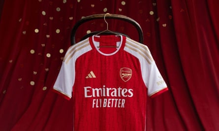
Arsenal’s new home shirt, with gold accent … despite finishing second. Photograph: Adidas/Arsenal
As Mikel Arteta aims to restore the Gunners to the title, it seemed a confidence-boosting idea for the designers to pay homage to the club’s Invincibles era on the “authentic” (ie player version) of the new home shirt: discreet taping commemorating the 26 wins and 12 draws over 38 games of that iconic season. Alas, due to an error, only 32 results were embossed. Not great for a £110 outlay.
The kit is truly lovely though. A darker shade of red (we’re told this new colour is called “Better Scarlet”, which, I’m so sorry, does sound like an advert a fiercely competitive call girl would place), the shirt features a subtle lightning motif on the jacquard body, as well as more boldly on the sock. Shorts are available in both white and red Better Scarlet. In a lush (if slightly cringe, given Arsenal came second) touch, the badge, Adidas logo and shoulder sponsor are in gold. Meanwhile, Aaron Ramsdale will be dressed as if he’s going to a funeral, in a smart all-black strip.
The men’s away kit? A homage to the 1997 cult classic film Anaconda. OK, fine, the looping black ribbon is supposed to emulate the routes hordes of fans take through the borough of Islington to the Emirates Stadium. No representation of the unnerving way Arsenal tube station resembles a prison, however. The kit, in “Solar Yellow”, will feature names and numbers in black when playing in the league, and electric blue for cup ties.
For the first time, the women’s team are slated to get their own away strip. Designed by Stella McCartney (who has collaborated with the club in the past), it resembles an ice-cream with plenty of sauce in its pink and teal tones. In other news, an unusual choice for the men’s away keeper kit to basically be a Chelsea home shirt, but there we are. No official news on the third kit, but rumours suggest this.
Aston Villa

Aston Villa’s Danielle Turner, Mayumi Pacheco, Sarah Mayling and Freya Gregory cosplaying as Hogwarts students. Photograph: Castore/Aston Villa
Congrats to Aston Villa, who, in a country in which hundreds of people addicted to gambling kill themselves each year, have betting company BK8 as their new front-of-shirt sponsor. Well played, guys!
The big switch-up this season, and fair play as this sort of thing does at least represent value for money, is Villa’s redesigned lion crest, inspired by the badge worn by the 1982 European Cup-winning side, and voted for by 77% of fans. The new lion very much looks like it is doing the Thriller dance.

Emiliano Buendía wears Aston Villa’s home kit well. Photograph: Mike Ehrmann/Getty Images for Premier League
The body of the Castore home shirt, still in claret and blue, has “a subtle print of sound waves taken from fans singing allez, allez, allez”, although to me it just looks like when a roll-on deodorant leaves dark smudges.
The away kit – “a unique design”, despite literally being a white shirt with blue shorts – is clean and inoffensive. I’m a big fan of the above launch photoshoot however, which gives strong vibes of Villa being a fifth Hogwarts house. The keeper kits come in black (home) and luminous green (away) colourways.
Bournemouth
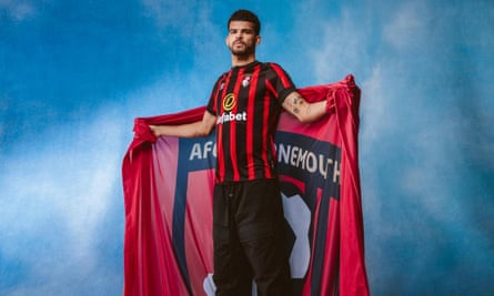
Dominic Solanke models Bournemouth’s new home kit. Photograph: Umbro/Bournemouth
Congrats to Bournemouth, who, in a country in which hundreds of people addicted to gambling kill themselves each year, have retained betting company Dafabet as their front-of-shirt sponsor. Well played, guys!

Kieffer Moore enjoying Bournemouth’s away kit. Photograph: James Marsh/Shutterstock
The Cherries have traded in their more outre zigzag home kit from last year for traditional black-and-red vertical stripes, and swapped the V-neck collar for a round one (as all kits should, imho). The black stripes being slightly thicker than the red doesn’t seem a big detail, and yet somehow adds a certain je ne sais quoi. The kit kindles memories of every millennial’s fave milk-teeth destroyer, Black and Red chew bars, but that’s priced in. The keeper jersey is a luminous yellow – which seems to be an unwelcome trend between the sticks this season.
The away kit is a lovely little pale blue number with a soothing wave motif reminiscent of the south coast sea – and there’s a Pepto-Bismol keeper kit, which is presumably less representative of the town but is certainly eye-catching.
Brentford

Wonderful inspiration is the pattern of a bee’s wing on Brentford’s new third kit. Photograph: Umbro/Brentford
Congrats to Brentford, who, in a country in which hundreds of people addicted to gambling kill themselves each year, and whose own star striker Ivan Toney has struggled with the issue, retain betting company HollywoodBet as their front-of-shirt sponsor. Well played, guys!

Conor McManus sports the more sustainable two-year Brentford home kit. Photograph: Paul Dennis/TGS Photo/Shutterstock
There’s not much exciting about the Bees’ new home kit, Umbro playing it safe. But the red-to-black fade on the vertical stripes is nice. It’s refreshing, too, that Brentford once again create their kits for a two-year cycle to both not gouge fans and increase sustainability (there is no new away kit this year).
There is a new third kit (above) and, as is typical, this is more creative. Navy, pink and turquoise in colour, the body pattern is influenced by a closeup of a bee’s wings, with the same design running down the trim on a turquoise short. The accompanying goalie strip is bright fuchsia with turquoise cuffs.
Brighton

Brighton’s shiny new kit is a pleasing improvement on the previous year’s. Photograph: Nike/Brighton
Brighton’s new home design is a pleasing improvement on last year’s, which was a bit unbalanced. For Brighton’s first season with European football, Nike has gone for a more classic look (and it’s not too dissimilar from the 2021-22 kit), measured blue and white stripes below the curved front seam of the shirt’s Dri-Fit template. There are other beautiful touches, including: navy cuffs; blue outlined white-bodied swoosh; and a dropped back hem. But the black of the Snickers logo on the sleeve jars.
Meanwhile, the new away kit was introduced with what can only be described as some awful use of the lasso tool in Photoshop – poor Katie Robinson. A green and black green striped shirt, it’s essentially a replica of the home version, but with crew neck. Shorts and socks will be black. No keeper or third kits have been officially launched yet.
Burnley
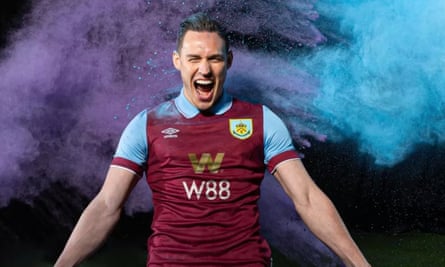
Conor Roberts enjoys Burnley’s new kit with Holi festival vibes. Photograph: Umbro/Burnley
Congrats to Burnley, who, in a country in which hundreds of people addicted to gambling kill themselves each year, introduce betting company W88 as their front-of-shirt sponsor. Well played, guys!
The club are celebrating their latest promotion by taking inspiration from their promotion strip of 1994. It’s a shirt that frankly barely raises a peak on an ECG, but at least the knitted blue polo collar with matching sleeves has an urbane feel. The shirt has a dropped back hem and woven applique crest. The traditional blue shorts go with the claret shirt and socks. (It truly is a shame that so many clubs have claret and blue as their traditional palette, given it is potentially the worst colour combination in the world.)
The kit photoshoot was sort of Burnley-by-way-of-India, with thrown powdered paint giving off the fun vibes of the Holi festival – although I doubt this was intended. Instead, the PR blurb tells of the players “showing their personalities in a variety of poses”, which in most cases is the charisma of a throw-in pretending to be taken.
The away shirt is, I’m afraid, a yellow monstrosity featuring a fuzzy-edged black and claret stripe that fully looks like when the paper gets jammed in a printer and the ink runs out. The simple crew neck and cuffs are redeeming. No news yet on the keeper or third kits.
Chelsea

Ben Chilwell models Chelsea’s home shirt in front of posters of era-defining rappers to ram home the 90s theme. Photograph: Nike/Chelsea
Chelsea have gone big on a 90s theme and it’s mostly a sartorial win, because the new kit bangs like OK Computer.
The launch saw it modelled by Ben Chilwell, who increasingly looks like Jack Whitehall, and he was rather amusingly standing in front of posters of era-defining rappers, which is cute because when Biggie was murdered Ben would have been a three-month-old in a sleepy Bedfordshire village. The shirt is currently sponsorless after the club was dropped by Three and backed out of a deal with Stake.com.
The Nike swoosh and badge are a shimmering gold, but iridescently so: they look variably turquoise, orange or invisible. It’s The Dress all over again, if the dress were made of sweat-wicking material and Mykhaylo Mudryk was wearing it. (And if you’re into optical illusions, you will love the rumoured, but unconfirmed, away strip, which is deepest black with a geometric print which calls to mind the gif a physicist would make to explain the rotation of a football.)
The ribbed cuffs with gold stripe is a nod to the halcyon days of Dennis Wise and Gianfranco Zola. Meanwhile, the home keeper kit is a mixture of black, grey and anthracite – it’s a type of coal, babes, look it up.
Crystal Palace
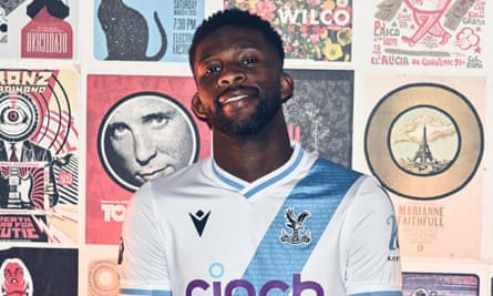
Jefferson Lerma models the Eagles’ new away strip in front of an interesting backdrop a la Chelsea. Photograph: Macron/Crystal Palace
It is very satisfying to me that Palace players this year will be dressed as bowling lane shoes, in a new half-and-half home design. There is something (bowling lane) undeniably goofy and fun about this strip from Macron (no, not that one), which would have been immense had the strip been colour-cleaved from top to bottom. As it is, both the shorts and socks are block blue. Boo!

Eberechi ** Eze celebrates a goal in Crystal Palace’s new strip. Photograph: Gregory Shamus/Getty Images
The away strip is in the original 1861 club colours of white and pale blue. The sash – and everyone does love a sash – is apparently a flavour of the 70s, which Palace have emphasised by getting Jefferson Lerma to stand in front of posters of those definitely-70s bands Franz Ferdinand and Wilco. The keeper kits will be a vivid green (home) and purple (away). No news yet on a third kit.
Everton
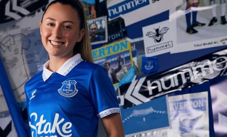
Clare Wheeler looks a fan of Everton’s new home kit. Photograph: Hummel/Everton FC
Congrats to Everton, who, in a country in which hundreds of people addicted to gambling kill themselves each year, have betting company Stake.com as their front-of-shirt sponsor. Well played, guys!
In a season in which Sean Dyche is hoping he can drag the Toffees out of the doldrums, Hummel has come up with a kit which is slightly verging on dull, except for one very beautiful element: the crisscross stitching on the collar and cuffs that represents the work of architect Archibald Leitch, and in particular the steel of Goodison Park’s upper tier. The blue shirt will be teamed with a white short and blue sock. The arches motif of Jordan Pickford’s dark green home kit is ostensibly inspired by St Luke’s church, with his away kit in black sporting a separate church roof motif.
The away outfield kit features a coral and navy blue striped shirt (inspired by the away colours of 1992-94), along with navy shorts and socks. I’ll level with you: it’s gross.
Fulham

Some fetching red and white shoulder stripes adorn Fulham’s new home look. Photograph: Adidas/Fulham
Well done to Fulham manager Marco Silva, who seems to be the only man working in the Premier League to have been offered but not taken Saudi money. But not well done to Fulham, who, in a country in which hundreds of people addicted to gambling kill themselves each year, retains betting company SBOTOP as their front-of-shirt sponsor. Well played, guys!
There’s one thing I love about the new Fulham home shirt, a shirt which at first glance looks very boring, and that is: the asymmetrical colours of the shoulder stripes (the stripes, on a black sleeve, run red on the left side, white on the right). White remains the main body colour, with the “London’s Original Football Club” mark at the base of the single-button collar on the back just to piss off everyone else living inside the M25. Shorts will be black with socks in either black or white. The home keeper strip is in long sleeves, head-to-toe red, with lime green accents.
Away and third kits are yet to be announced, but I do hope the away one proves to be this, which has the energy of Jackson Pollock running out of all paint except for purple and black.
Liverpool

Luis Díaz, Darwin Núñez and Mohamed Salah model Liverpool’s stylish new home threads, complete with shades. Photograph: Nike/Liverpool
Jordan Henderson has received a lot of deserved flak for his move to Saudi Arabia, but if he’d stayed on Merseyside, he would basically have been wearing the Gulf state’s national strip half the time. Liverpool’s new away kit is a quarter-design (or, as I like to call it, Battenberg) of Saudi green and white, with black collar and cuffs. It’s supposed to evoke the side’s 1995-96 away strip. There’s also something quite Microsoft Office about the blocky graphic.
The all-red home strip however is gorgeous, even allowing for my bias. It’s a throwback to the 1973-74 FA Cup winning squad, but, to my mind, also recalls the glory days of Michael Owen’s 1998-99 season. The white crew neck and cuffs match the white crest, logo, and sponsor giving the entire shirt a clean, minimalist feel. Truly a joy, and after the signature of Dominik Szoboszlai, let’s hope the club shop doesn’t run out of letter Zs.

Diogo Jota wears Liverpool’s new Battenberg away strip during a pre-season friendly. Photograph: Playmaker/MB Media/Getty Images
Last year’s third kit split opinion; the bottle green with red accents design either loved (by me) or reviled (by everyone else). I don’t know if this means that what, to me, is clearly a hideous purple successor will be universally adored.
Alisson will be wearing essentially the same home goalie kit as Chelsea, but with lime green sponsor, swoosh and badge. The away look is a burnt orange colour (or “Taxi”, according to Nike) and the Brazilian’s third look, as debuted in last season’s final match, is a mixture of greens.
Luton Town

Tom Lockyer in Luton’s new home kit influenced by the 1974-75 beaut of a strip. Photograph: Phil Duncan/Shutterstock
I can’t decide on Luton Town’s Premier League effort. A problem is that the home kit, in the club’s traditional easyJet orange and black, is influenced by a kit so utterly superior that it can’t but fall short. In this case, Luton’s 1974-75 utter beaut of a strip. Where that kit had a funky 70s collar and a bold, confident, right-justified white stripe, this version has a fuzzy stripe that looks not unlike a hastily assembled line of cocaine.
The away look is the exact same jersey but with the colours flipped round (ie. orange stripe on white). Thank god Luton has one of the busiest crests – based on the town’s coat of arms, and includes a beehive, boater hat, thistle and rose – to liven things up a bit. It’s a shame Umbro haven’t given them something more exciting for their second uniform, but I salute the home attempt and it’s refreshing to have a new colour in the Prem. No news yet on keeper or third kits.
Manchester City

Manchester City’s ‘electric’ third kit. Photograph: Robbie Jay Barratt/AMA/Getty Images
City’s new home strip pays tribute to the 20th anniversary of the Etihad, with a printed diagram of the stadium on the back inside of the shirt’s V-neck collar. The wide stripe design (in all sky blue) also emulates the jersey worn during the stadium’s inaugural season. I am caught between thinking Puma have pulled off the year’s dullest kit, and really quite admiring its understated attitude. The main home short will be white with a blue stripe, with a secondary, darker, “lake blue” pair on colour clash standby – these are actually nicer. Socks will be the standard sky blue.

Erling Haaland in Manchester City’s new understated home kit. Photograph: Robbie Jay Barratt/AMA/Getty Images
In contrast to the very low-key home outfield kit, Ederson will be raving it up in any of three snazzily arrow-patterned, neon kits. The third (outfield) jersey (above), meanwhile, is “inspired by the electric energy of the team” with a lightning-fork body pattern in teal against a black background. It will be worn in European away games with matching shorts and socks. The kit was leaked back in January, but was officially debuted last week in Japan. The very-much-unconfirmed new away kit is a demure cream and claret look, with retro collar.
Manchester United

Mason Mount in Manchester United’s nice new shirt. Photograph: Getty Images
It is with a heavy LFC-supporting heart that I must admit that Adidas have served United well this year, with all of their strips delivering. Perhaps the nicest element on the home shirt is the famous Lancashire Rose reinvented as a football tucked on the inside back collar. The jacquard lattice work on the body of the shirt is a nod to the Industrial Revolution’s Trafford Road Bridge.
The main home shorts will be white with black socks. Unlike England fans, United supporters will be able to buy a Mary Earps shirt. Although the keeper’s top is a rather boring lime green with black arm panels.

Jadon Sancho wears Manchester United’s new classy, striped mixture kit during a US friendly. Photograph: Ash Donelon/Manchester United/Getty Images
The away strip is a classy, striped mixture of “night green” and red pinstripe design. Perhaps the most attention-grabbing aspect is that the Adidas stripes run the entire length of the long sleeved iteration. Mind you, I am the only one who seems to like this kit, the rest of the internet damning it as disgusting. The sponsor logo is still way too large and distracting however.
The third kit has not been announced yet, but if leaks prove to be true it is likely to be a cream number with, unusually, a different badge from its sibling kits.
Newcastle United

Emma Kelly shows off Newcastle’s new home strip against Hibernian. Photograph: Colin Poultney/ProSports/Shutterstock
The Magpies’ home kit never deviates much, but Castore have designed a sleek strip here, the monochrome logo unobtrusively slotting into the overall appearance. There’s a well thought out V-neck and short-trim cuffs, and those trademark stripes a perfect width. As is usual, shorts will be black (with white alternates) and socks white. The keeper’s look will be luminous yellow (sigh).
The away kit has been much talked about due to its Saudi flag colourway, although the shirt is actually “Golf Green”, which is appropriate, because golf’s now been egregiously bought, too. The shirt has a dropped back hem and raglan sleeves, with black logo, crest and sponsor. The shorts are white with green and black socks, and the goalie strip is in turquoise.
Finally, the third kit isn’t great, a kind of thrown-together navy and yellow thing, but the badge in the yellow is certainly striking.
Nottingham Forest

Joe Worrall, Taiwo Awoniyi and Danilo enthusiastically model Nottingham Forest’s new kits. Photograph: Adidas/Nottingham Forest
Making everybody’s life a lot easier, at least in a kit-related regard, Forest unveiled all three of their as-yet-unsponsored new kits at the same time. Adidas replaces former manufacturer, Macron. The home outfit is a very simple affair, the hope to conjure up the performances of the unfussily dressed 1979 and 1980 European Cup-winning heroes. The shirt is plain red, with a round white collar, and white logos and underarm panel, teamed with a white short and red sock.
Following the watery inspiration of Bournemouth’s away kit, Forest’s second strip is also water-based, its light blue wavy stripes on white apparently a homage to the river Trent – but really it looks more a homage to Lionel Messi, given its likeness to an Argentina strip. The third kit is a kind of busy black number which is meant to have something to do with the castle, but it remains unclear what. The kits look all the better in their sponsorless state.
Sheffield United

Oli McBurnie in a beauty of a home shirt for Sheffield United – and so far sponsorless. Photograph: Errea/SUFC
The Blades’ kit does not feature a sponsor yet either as the club’s deal with Randox has expired. I have no idea if it will be renewed, but given we all surely now associate that brand with desperately sourced, pre-airport lateral flow tests, I’d hope not. The new home shirt is a thing of majestic sophistry. Two thick white stripes are sandwiched between a red on the front, and separated by narrow black lines which match the collar and ribbed cuff. Its main aesthetic antecedent is the club’s 1997-99 Le Coq Sportif shirt. It’s one of the simplest but most handsome home jerseys this season. The home keeper kit is also very grown up: block white with a black side panel and the same collar ‘n’ cuffs as the outfield.
The third kit is steel-grey (obviously, this is Sheffield) head-to-toe, with red side panels (and alternative red shorts and socks for potential colour-clash incidents). The away kit has not been unveiled yet, unless you’re keeping tabs on Yasser Larouci’s Snapchat stories, which reps from manufacturer Errea hope you are not.
Tottenham Hotspur

Emerson Royal and Richarlison in Spurs’ new all-white affair. Photograph: Suhaimi Abdullah/NurPhoto/Shutterstock
For the first time in a decade, Spurs men’s team will play in a totally white (shirt, shorts and socks) home strip. (The women’s team will wear navy shorts.) It’s a handsome strip that any Spurs-supporting Nike tennis athlete could chuck on at Wimbledon next summer. In fact, can we entirely rule out this photograph of Emma Raducanu training in a Tottenham shirt with white shorts as the inspiration? It’s a beautiful kit – and the nightmare of parents with small children. The home keeper kit is a bright blue number which resembles the ice cube emoji in its vibrancy and gradient.
If rumour is to be believed, the away strip will be a navy and retro collar affair, and have the same iridescent Nike logo of Chelsea’s home strip. The less said about the mooted third kit, which is the approximate colour of clinical depression, the better.
West Ham

Jarrod Bowen, Maxwel Cornet and Flynn Downes forever blowing bubbles, sometimes wearing them with West Ham. Photograph: Umbro/West Ham
Congrats to West Ham, who, in a country in which hundreds of people addicted to gambling kill themselves each year, retain Betway as their front-of-shirt sponsor. Well played, guys!
Christ, claret and blue is boring. And, unfortunately for Hammers fans, Umbro decided to get a bit too cute with this home shirt and put what are ostensibly West Ham’s anthemic bubbles on the body. The idea was there, but the execution is poor. Sleeves are plain blue, claret cuffs … you know the very boring drill. At least last season’s sleeves were an inspired chaos. Shorts are either in blue or claret, with the socks hooped. The keeper’s kit is a much brighter and funkier affair, a lime green with pink edges.
The away design could have been very nice indeed – a clean, sleek white from head to toe. But a silver logo and badge on a white pique fabric body renders both barely visible, which actually could also have looked quite fresh – except it just leaves a giant black BETWAY to dominate the entire shirt. Such a shame on what would otherwise be a very good-looking strip. The away goalie kit is yet another one in yellow. No third kit announced yet, but it surely cannot be worse than last season’s.
Wolves
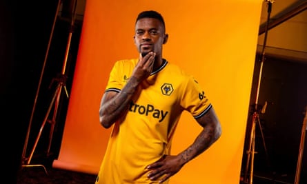
Nelson Semedo in Wolves’ new, rather dull, home kit. Photograph: Castore/Wolves
Congrats to Wolves, who, in a country in which hundreds of people addicted to gambling kill themselves each year, have the gambling enterprise 6686 Sports as their new sleeve partner. Well played, guys!
Alas, the new home kit is disappointingly dull. All the Wolves standards are there: solid gold base shirt, black shorts, gold socks, but with zero flair. The tapered collar and ribbed cuffs are fine. I am reliably informed there are jacquard pinstripes on the body of the shirt, but I am yet to decipher these with the naked eye, and the press release describes them as “a nod to the 1980s and club legends such as Andy Gray” and I honestly just don’t want to be thinking of Andy Gray at all.

Academy player Ty Barnett in Wolves’ beautiful away kit. Photograph: Jack Thomas/WWFC/Wolves/Getty Images
Thankfully, Castore has upped its game elsewhere. The keeper kits are in “beetroot” (home) and “acid lime” (away), and while you wouldn’t think a West Midlands club would have an away strip “inspired by the geometric architecture and tile patterns found around the Iberian Peninsula”, it makes for both a beautiful kit and a taste of home for the first team’s ample southern European contingent. The red mosaic of the body is offset with gold piping and woven crest. If you were going to be harsh you could argue the addition of black shoulder and underarm panels pushes it into Manchester United home shirt territory. The third kit is potentially a teal number, but this remains unconfirmed. Just as long as it isn’t inspired by Andy Gray.